

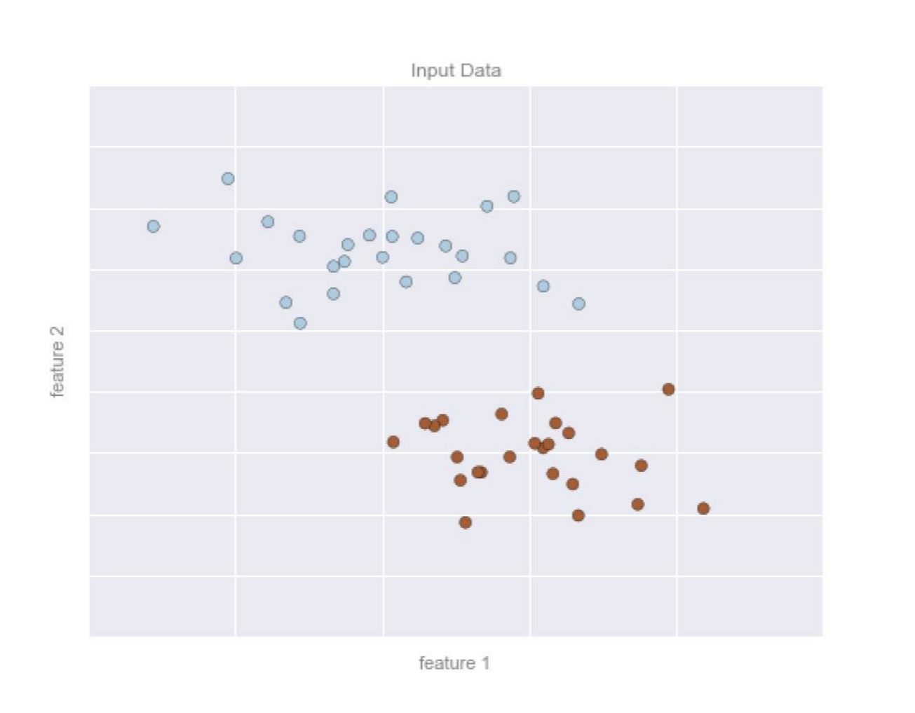
Machine learning involves building models of data based on features available in the data. In Supervised Learning, features have some labels associated with them.
For examle:
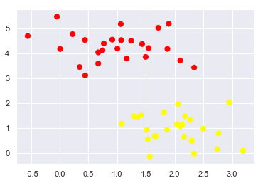
A 2D data will have 2 features represented by the (x,y) positions of the points on the plane.
The data is classified with 2 or more class labels, which can be represented by colors of the points.
Assuming that the 2 classes of data can be separated by drawing a line between the data points, the line represents the model.
The numbers describing the location and orientation of the line are model parameters - values for these model parameters are “learned” from the data, which is known as training the model.
Once the model has been trained, it can be generalized to new data. Assigning labels to new unclassified points based on the model is called prediction.
 After trained ==>
There are three different kinds of Data Classification Approaches, respectively Functional Approach (Logistic Regression), Statistical Approach (Naive Bayes), Geometrical Approach (Perceptron, SVM).
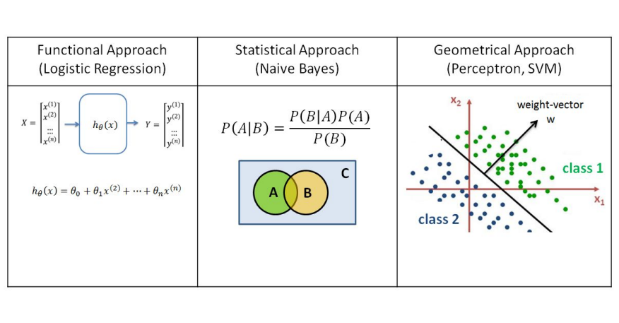
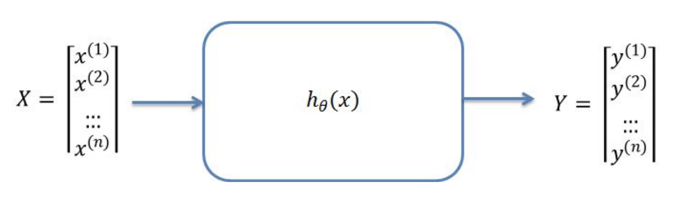
In functional approaches to data classification, such as logistic regression, the goal is to find a hypothetical function h(x) which can best describe the correlation between variables x and y.
If the input data is 2D, the function is a curve which fits through the data points. In 3D the function represents a plane and in higher dimensions a hyperplane.
The mathematical function used in Logistic Regression is known as a sigmoid (aka logistic). The output of the function is between 0 and 1 for all input values. The formula is:
\[f(x) = \frac{1}{1+e^{-x}}\] 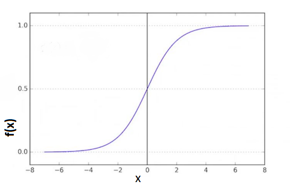
Code Example:
import numpy as np
import matplotlib.pyplot as plt
from sklearn import linear_model
'''=====================Visualzation Function========================'''
def visualize_classifier(classifier, x,y):
# Define the min and max values for x and y
# that will be used in the mesh grid
min_x = x[:,0].min()-1.0 # show the first col of x's min value-1
max_x = x[:,0].max()+1.0 # show the first col of x's max value+1
min_y = x[:,1].min()-1.0 # show the second col of x's min value-1
max_y = x[:,1].max()+1.0 # show the second col of x's max value+1
# Define the step size to use in plotting the mesh grid
mesh_step_size = 0.01
# Define the mesh grid of x and y values
x_vals,y_vals = np.meshgrid(np.arange(min_x, max_x, mesh_step_size),
np.arange(min_y, max_y, mesh_step_size))
# Run the classifier on the mesh grid
output = classifier.predict(np.c_[x_vals.ravel(), y_vals.ravel()])
# Reshape the output array
output = output.reshape(x_vals.shape)
# Create a plot
plt.figure()
# Choose a color scheme for the plot
plt.pcolormesh(x_vals, y_vals, output, cmap=plt.cm.gray)
# Overlay the training points on the plot
plt.scatter(x[:, 0], x[:, 1], c=y, s=75, edgecolors='black',
linewidth=1, cmap=plt.cm.Paired)
# Specify the boundaries of the plot
plt.xlim(x_vals.min(), x_vals.max())
plt.ylim(y_vals.min(), y_vals.max())
# Specify the ticks on the X and Y axes
plt.xticks((np.arange(int(x[:, 0].min() - 1),
int(x[:, 0].max() + 1), 1.0)))
plt.yticks((np.arange(int(x[:, 1].min() - 1),
int(x[:, 1].max() + 1), 1.0)))
#plt.show() # only don't call in jupyter
'''=============================Main================================='''
# Define sample input data
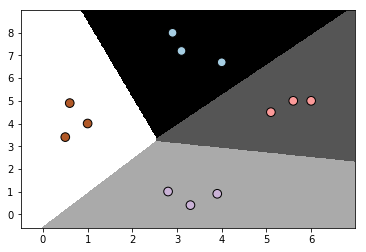
x = np.array([[3.1, 7.2],
[4, 6.7],
[2.9, 8],
[5.1, 4.5],
[6, 5],
[5.6, 5],
[3.3, 0.4],
[3.9, 0.9],
[2.8, 1],
[0.5, 3.4],
[1, 4],
[0.6, 4.9]])
y = np.array([0, 0, 0, 1, 1, 1, 2, 2, 2, 3, 3, 3])
# Create the logistic regression classifier
classifier = linear_model.LogisticRegression(solver='liblinear', C=100)
# Train the classifier
classifier.fit(x, y)
# Visualize the performance of the classifier
visualize_classifier(classifier, x, y)
Output:
Naive Bayes models are a group of extremely fast and simple classification algorithms that are often suitable for very high-demensional dataset. Therefore, it end up being very useful as a quick-and-dirty baseline for a classification problem.
Naive Bayes classifiers are built on Bayesian classification methods. These rely on Bayes’s theorem. In Bayesian classification, we’re interested in finding the probability of a label given some observed features, which we can write as: \(P(A~|~{B})\)
Mathematically, conditional probability of A given B is expressed by the following formula:
\[\Large P(A~|~B) = \frac{P(A \cap B)}{P(B)}\]However, based on this formula:
\[\Large P(A \cap B)=P(A~|~B)\cdot P(B)\]The same applies for B given A:
\[\Large P(A \cap B)=P(B~|~A)\cdot P(A)\]Therefore, The propability of A given B can be re-written as Bayes’s Rule:
\[\Large P(A~|~B) = \frac{P(B~|~A)P(A)}{P(B)}\]If we are trying to decide between two labels, $A_1$ and $A_2$, one way to make decision is compute the ratio of the posterior probabilities for each label:
\[\Large \frac{P(A_1~|~B)}{P(A_2~|~B)} = \frac{P(B~|~A_1)P(A_1)}{P(B~|~A_2)P(A_2)}\]The important things need to know is some model by which we can compute \(P(B~|~A_i)\) for each label. This is called a generative model, because it specifies the hypothetical random process that generates the data. Specifying this generative model for each label is the main piece of the training of such Bayesian classifier.
Naive Bayes classifier calculates the probabilities for every feature available in the data and selects the outcome with highest probability. It is a popular and powerful algorithm used for:
Code Example:
import numpy as np
import matplotlib.pyplot as plt
from sklearn.naive_bayes import GaussianNB
'''======================Visualzation Function========================='''
def visualize_classifier(classifier, x,y):
# Define the min and max values for x and y
# that will be used in the mesh grid
min_x = x[:,0].min()-1.0 # show the first col of x's min value-1
max_x = x[:,0].max()+1.0 # show the first col of x's max value+1
min_y = x[:,1].min()-1.0 # show the second col of x's min value-1
max_y = x[:,1].max()+1.0 # show the second col of x's max value+1
# Define the step size to use in plotting the mesh grid
mesh_step_size = 0.01
# Define the mesh grid of x and y values
x_vals, y_vals = np.meshgrid(np.arange(min_x, max_x, mesh_step_size),
np.arange(min_y, max_y, mesh_step_size))
# Run the classifier on the mesh grid
output = classifier.predict(np.c_[x_vals.ravel(), y_vals.ravel()])
# Reshape the output array
output = output.reshape(x_vals.shape)
# Create a plot
plt.figure()
# Choose a color scheme for the plot
plt.pcolormesh(x_vals, y_vals, output, cmap=plt.cm.gray)
# Overlay the training points on the plot
plt.scatter(x[:, 0], x[:, 1], c=y, s=75, edgecolors='black',
linewidth=1, cmap=plt.cm.Paired)
# Specify the boundaries of the plot
plt.xlim(x_vals.min(), x_vals.max())
plt.ylim(y_vals.min(), y_vals.max())
# Specify the ticks on the X and Y axes
plt.xticks((np.arange(int(x[:, 0].min() - 1),
int(x[:, 0].max() + 1), 1.0)))
plt.yticks((np.arange(int(x[:, 1].min() - 1),
int(x[:, 1].max() + 1), 1.0)))
#plt.show() # only don't call in jupyter
'''==============================Main=================================='''
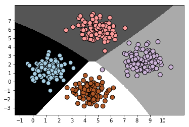
# Load data from input file
input_file = 'data_multivar_nb.txt'
data = np.loadtxt(input_file,delimiter=',')
x = data[:,:-1]
#print('\n x Data: \n',x)
y = data[:,-1]
#print('\n y Data: \n',y)
# Create Naive Bayes classifier
classifier = GaussianNB()
# Train the classifier and predict the value for training data
classifier.fit(x,y)
y_pred = classifier.predict(x)
# Visualize the performance of the classifier
visualize_classifier(classifier,x,y)
Output:
Confusion Matrix is a table that is often used to describe the performance of a classification model on a set of test data for which the true values are already known.
● True Positive (TP) - cases in which we predicted yes and the actual value was true. ● True Negative (TN) - cases in which we predicted no and the actual value was false. ● False Positive (FP) - cases which we predicted yes and the actual value was False. ● False Negative (FN) - cases which we predicted No and the actual value was true.
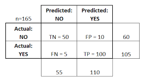
For this confusion matrix, to calculate the accuracy of the model:
\(\frac{ TP + TN }{Total} = \frac{100 + 50} {165} = 0.91 = 91\%\) (correct rate)
The confusion matrix is also used to measure the error rate:
\(\frac{ FP + FN } {Total} = \frac{15}{165} = 0.09 = 9\%\) (error rate)
Code Example:
import numpy as np
import matplotlib.pyplot as plt
from sklearn.metrics import confusion_matrix
from sklearn.metrics import classification_report
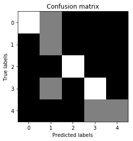
# Define sample labels
true_labels = [2, 0, 0, 2, 4, 4, 1, 0, 3, 3, 3]
pred_labels = [2, 1, 0, 2, 4, 3, 1, 0, 1, 3, 3]
# Create confusion matrix
confusion_mat = confusion_matrix(true_labels, pred_labels)
# Visualize confusion matrix
plt.imshow(confusion_mat, interpolation='nearest', cmap=plt.cm.gray)
plt.title('Confusion matrix')
plt.ylabel('True labels')
plt.xlabel('Predicted labels')
plt.show()
Output:
Perceptron is a computational model of a single neuron, consisting of one or more inputs, a processor, and a single output. Each input value x is multiplied by a weight-factor w. If the resulting sum is larger than zero, the perceptron is activated and ‘fires’ a signal.
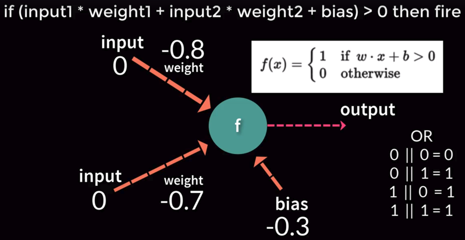
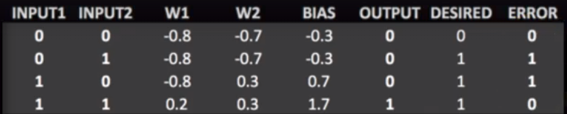
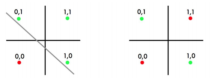
Perceptron can be trained to find a line separating two classes inthe limited case of linearly separable datasets.

Perceptron is a computational model of a single neuron, consisting of one or more inputs, a processor, and a single output. Each input value x is multiplied by a weight-factor w. If the resulting sum is larger than zero, the perceptron is activated and ‘fires’ a signal.
Inability of perceptrons to solve non-linear problems led to the initial disillusionment in this area of research and a period known as “AI winter” in 1970s.
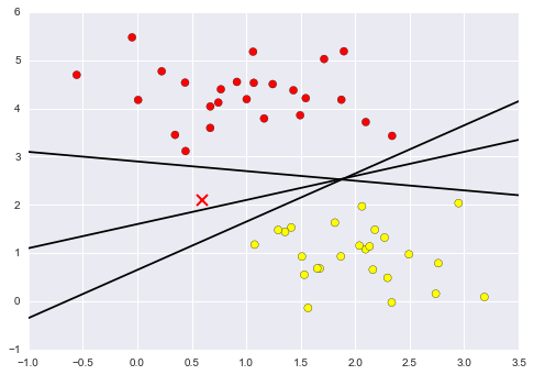
Linear Classifier only will have a problem is when find a separating hyperplane, but not the optimal one, such as perceptron.
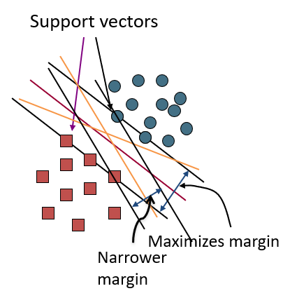
Support Vector Machine (SVM) finds an optimal solution. It can maximize the margin around the separating hyperplane. The decision function is fully specified by a subset of training samples, the support vectors.(Solving SVMs is a quadratic programming problem)
As an example of this, consider the simple case of a classification task, in which the two classes of points are well separated:
A linear classifier is attempting to draw a straight line separating the two sets of data, and thereby create a model for classification. However, here we have lots of possible solutions to draw a separated line between two data sets.
SVM offers one way to improve on this. The intuition is this: rather than simply drawing a zero-width line between the classes, we can draw around each line a margin of some width, up to the nearest point. it looks like this:
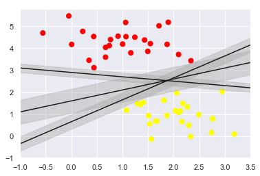
In support vector machines, the line that maximizes this margin is the one we will choose as the optimal model.
Code Example:
import numpy as np
import matplotlib.pyplot as plt
from scipy import stats
# use seaborn plotting defaults
import seaborn as sns; sns.set()
from sklearn.datasets.samples_generator import make_blobs
from sklearn.svm import SVC # "Support vector classifier"

X, y = make_blobs(n_samples=50, centers=2,
                  random_state=0, cluster_std=0.60)

model = SVC(kernel='linear', C=1E10)
model.fit(X, y)

"""Plot the decision function for a 2D SVC"""
def plot_svc_decision_function(model, ax=None, plot_support=True):

    if ax is None:
        ax = plt.gca()
    xlim = ax.get_xlim()
    ylim = ax.get_ylim()

    # create grid to evaluate model
    x = np.linspace(xlim[0], xlim[1], 30)
    y = np.linspace(ylim[0], ylim[1], 30)
    Y, X = np.meshgrid(y, x)
    xy = np.vstack([X.ravel(), Y.ravel()]).T
    P = model.decision_function(xy).reshape(X.shape)

    # plot decision boundary and margins
    ax.contour(X, Y, P, colors='k',
               levels=[-1, 0, 1], alpha=0.5,
               linestyles=['--', '-', '--'])

    # plot support vectors
    if plot_support:
        ax.scatter(model.support_vectors_[:, 0],
                   model.support_vectors_[:, 1],
                   s=300, linewidth=1, facecolors='none');
    ax.set_xlim(xlim)
    ax.set_ylim(ylim)

# draw scatter plot
plt.scatter(X[:, 0], X[:, 1], c=y, s=50, cmap='autumn')

# call the draw line function
plot_svc_decision_function(model);
Output:

Also, If 2D data can’t be separated by a line, SVM can classify data by adding an extra dimension to it to make it linearly separable and then projecting the resulting boundary back to original dimensions using a mathematical transformation(such as matrix transformation).

End –Cheng Gu